Calendar Scheduling Redesign
Led design for the core calendar UI, reducing cognitive load by implementing quick actions, and increasing usability while streamlining scheduling for front staff.
Cut appointment-slot lookup time from minutes to under 2 seconds and reduced core scheduling task times by up to 80%, leading design across 20+ scheduling and batch data-management features.
Role
Senior Product Designer
Team Members
1 Product Owner, Engineering (varied by project)
Timeline
6-12 mos (based on feature)
Beyond One Product
When Costco's Hearing Center platform needed a scheduling solution, their team turned to the patterns I'd built for Sycle's clinical workspace. I worked directly with Costco and Sycle stakeholders, including AVP-level presence on U.S./Canada calls, to adapt the model for Costco's scale while protecting the workflow needs of Sycle's smaller clinics. The result was a shared scheduling approach that served both a national retail health platform and independent clinic operators.

As competing audiology platforms modernized, parts of Sycle's software fell behind, both visually and in day-to-day usability.
Customers of every size reported broken UI flows and confusing usability that wore down their staff and pushed clinicians toward competing products. We needed to understand why, and rebuild trust in the product.
I led design across three separate projects that allowed me to cascade my solutions into one another. I used the four pillars that formed the foundational framework of the user-centered product process. Most importantly, introducing feedback loops early in the process in collaboration with a Product Owner, Engineering, QA and Customers.
Led design for the core calendar UI, reducing cognitive load by implementing quick actions, and increasing usability while streamlining scheduling for front staff.
Designed several enhancements abiding by Costco's corporate compliance rules into dedicated schedule block logic while maximizing room utilization without breaking enterprise constraints.
Directed rapid iterative design via an AI-augmented prototyping pipeline to overhaul a fragmented referral system, unifying cross-functional alignment and accelerating Product leadership decision-making.
Redesigning the calendar was the largest lift as it meant deep dive research with 40 clinics and understanding each customer’s problems (the who, what and why?). Then iteratively finding the deltas between existing flows and discovering new efficient ones and then validating them.
Product Owner
1
Engineering
6 Engineers
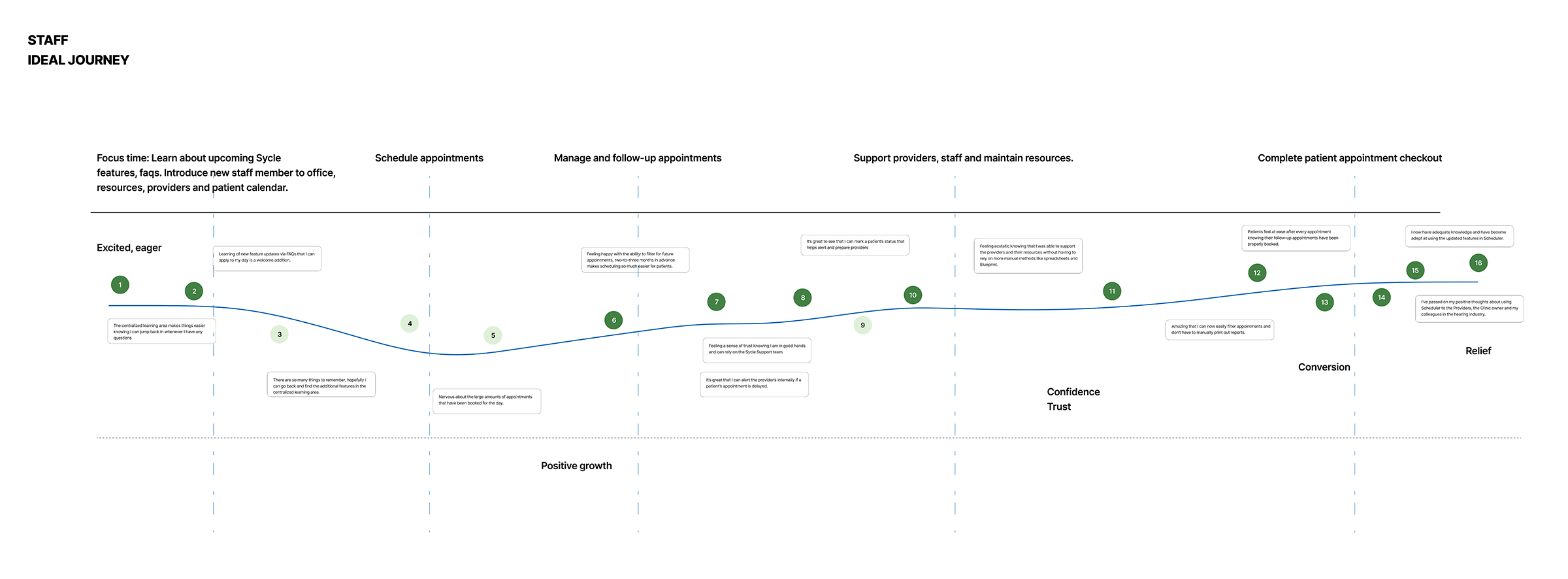
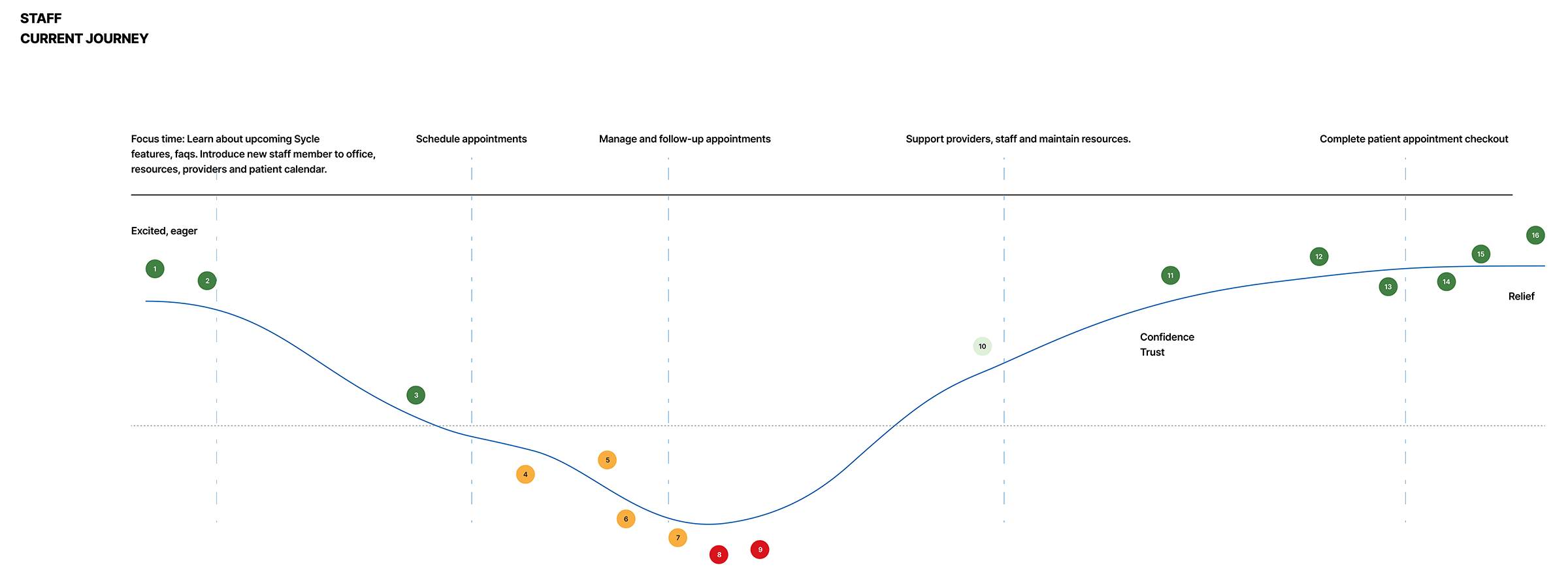
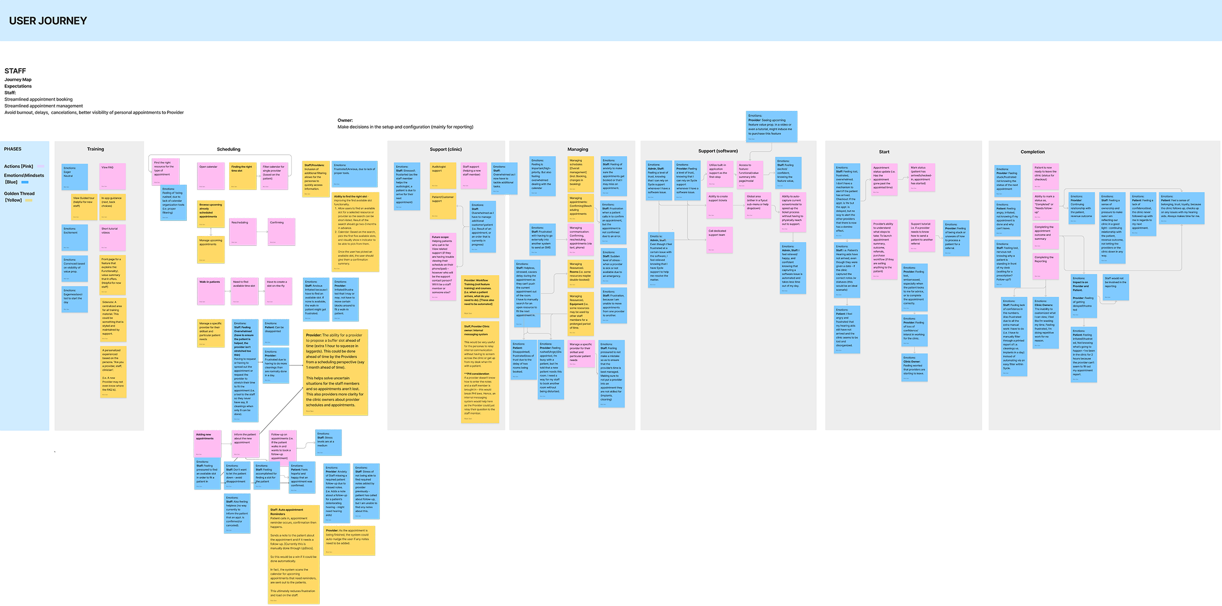
A side-by-side look at the original calendar experience and the redesigned direction, consolidating quick links and surfacing appointment signals for front-desk staff.
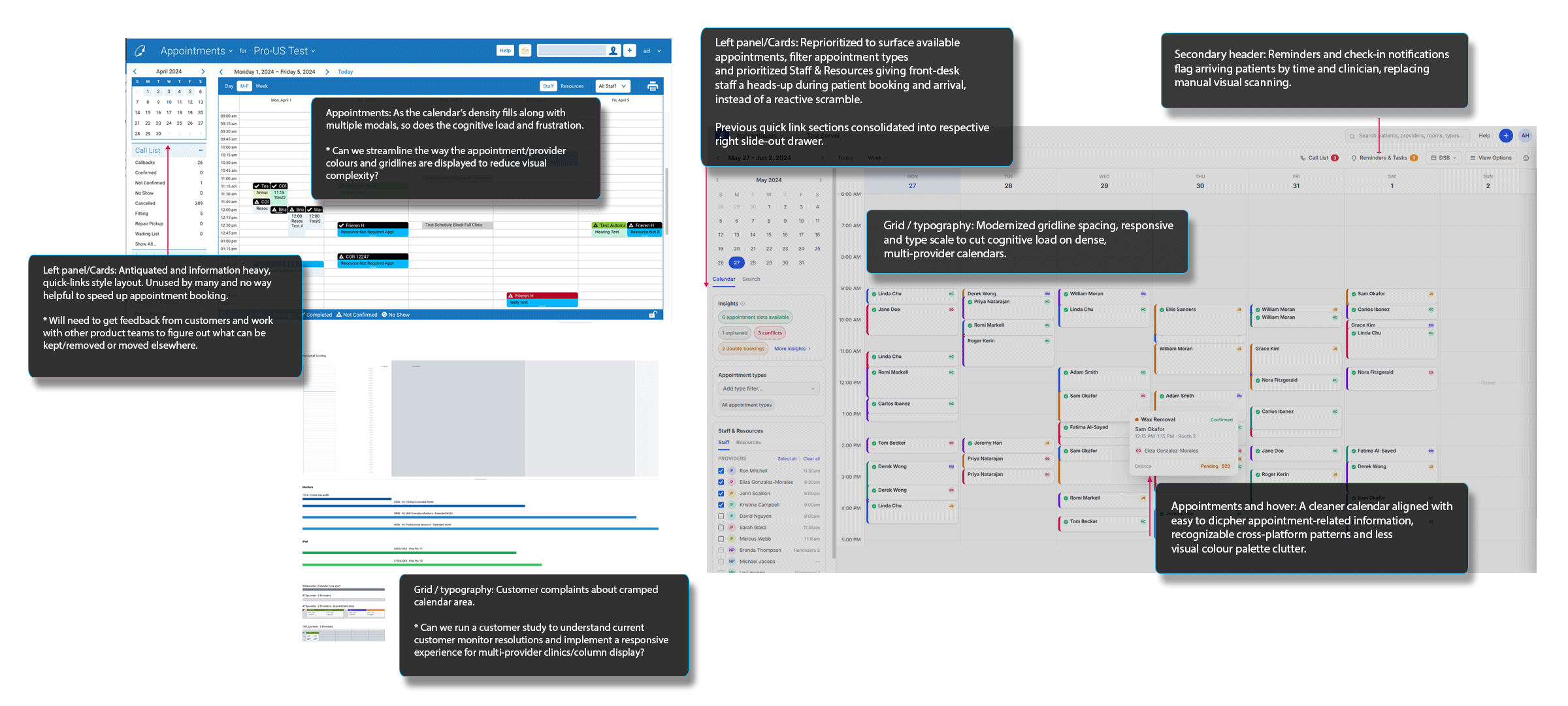
Staff complained the interface had "too many modals" and "too much scrolling." I replaced dense modal flows with drawers and quick-action menus, and rebuilt the calendar's visual hierarchy so appointment slots were easier to read and responsive enough so other visual elements could be customized based on customer needs. These improvements kept clinicians oriented on busy schedules without losing their place.
A Note on the Design System
Sycle's design system is proprietary and protected under NDA, so the underlying component library and documentation can't be shared here. The spacing, typography, and interaction patterns it defines are reflected throughout the screenshots and interactive prototype in this case study instead.
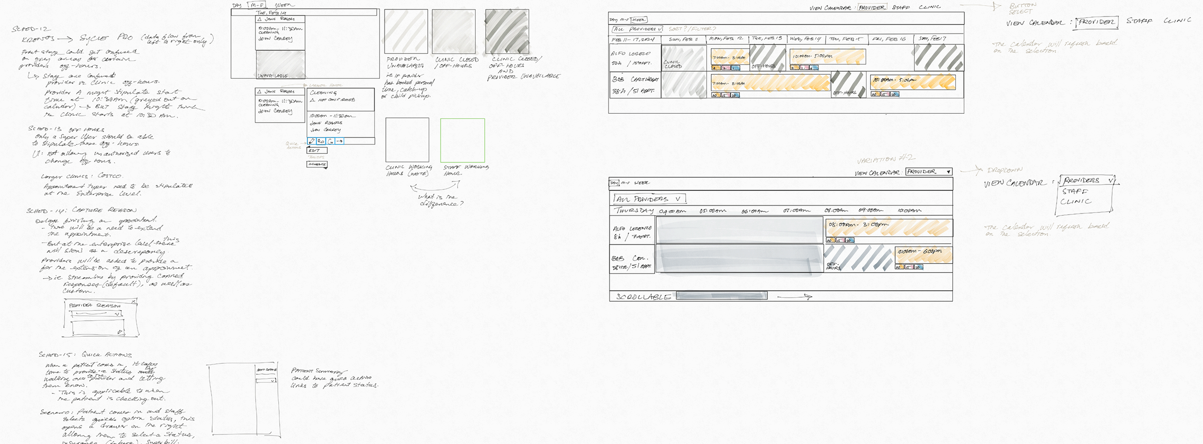
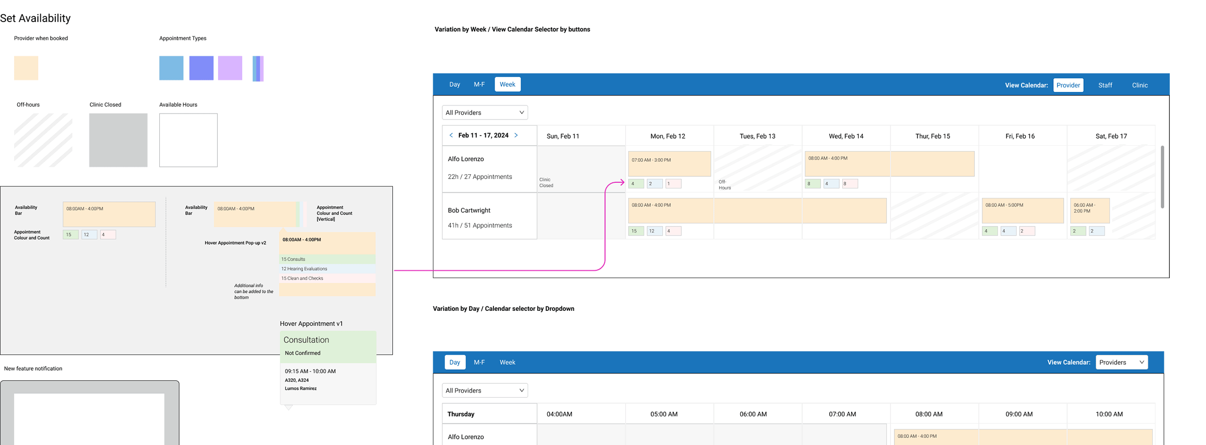
_sml.png)
Reasoning Behind the Finish
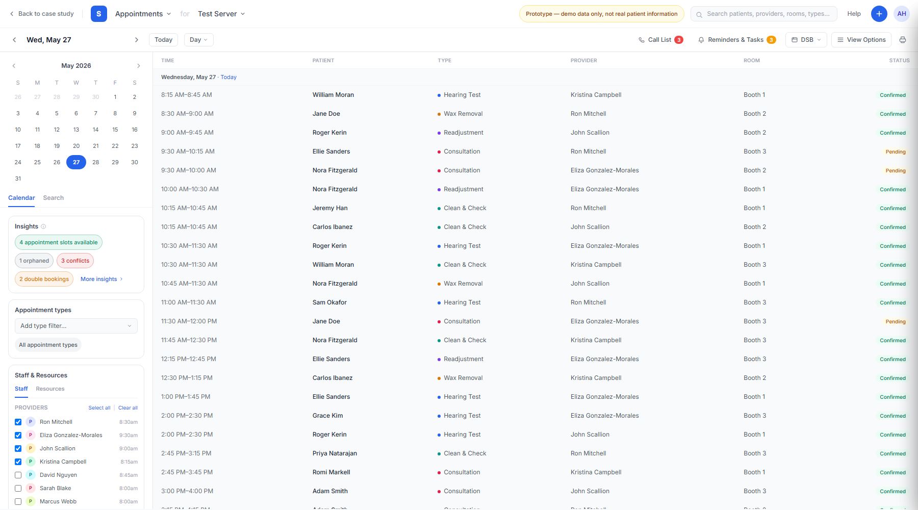
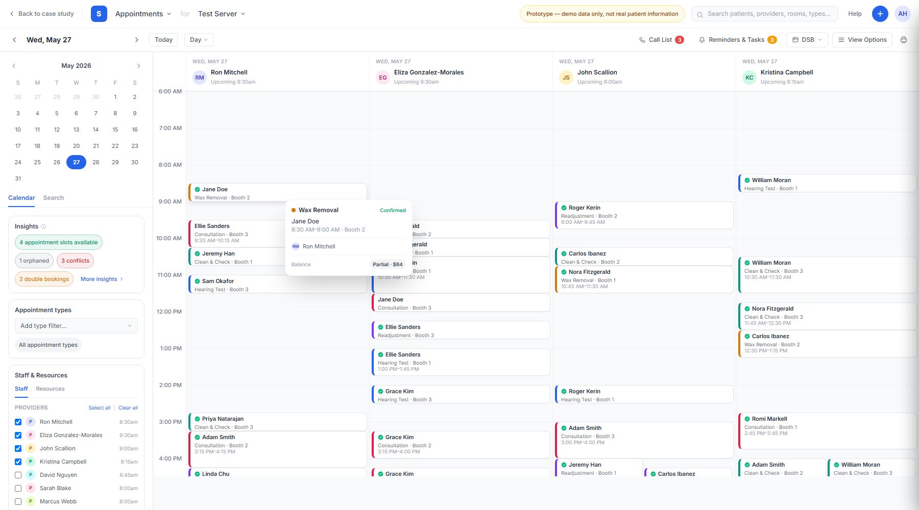
The agenda gave front staff and clinicians a bird's-eye view of all current and future appointments, with quick text, email, and phone actions built in. Appointment hovers then surfaced patient, provider, and room details on demand, collapsing into a smaller footprint based on user settings.
Scheduling insights surface open slots, conflicts, and double-bookings inline, so front-desk staff catch scheduling gaps without manually scanning the grid.
Clicking an open slot launches a lightweight booking flow right in place (patient, appointment type, and room) instead of a separate modal-heavy scheduling screen.
Staff and resource checkboxes filter the calendar by provider and room, and the grid scales cleanly from a handful of providers up to a full multi-provider clinic without breaking column alignment.
A one-click theme toggle in View Options gives front-desk staff a low-light option for dim rooms and evening shifts, without needing a second design system.
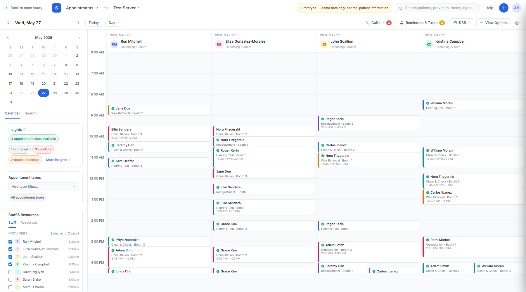
System (light)
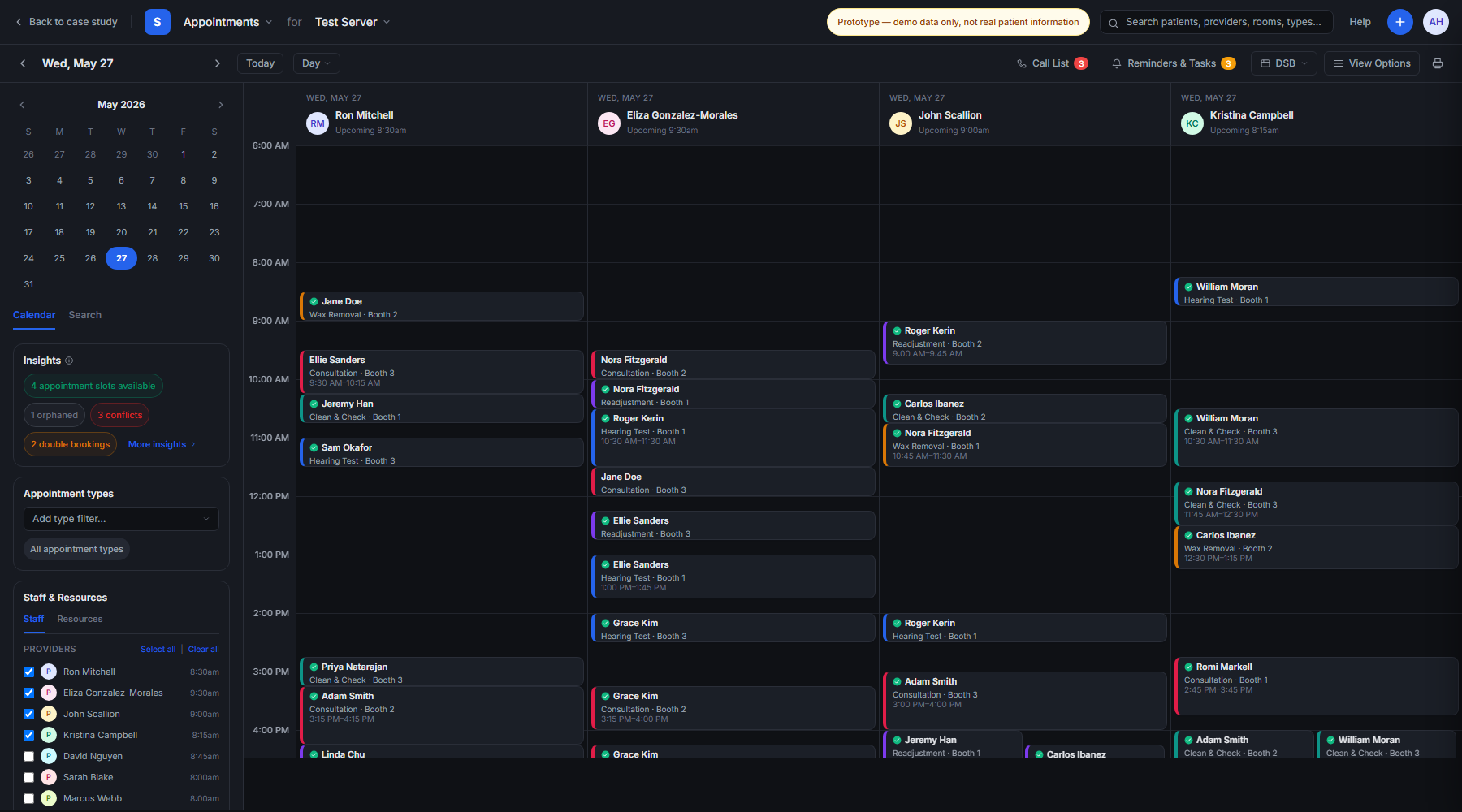
Dark
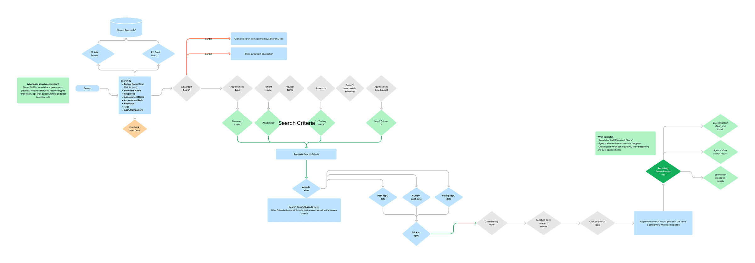
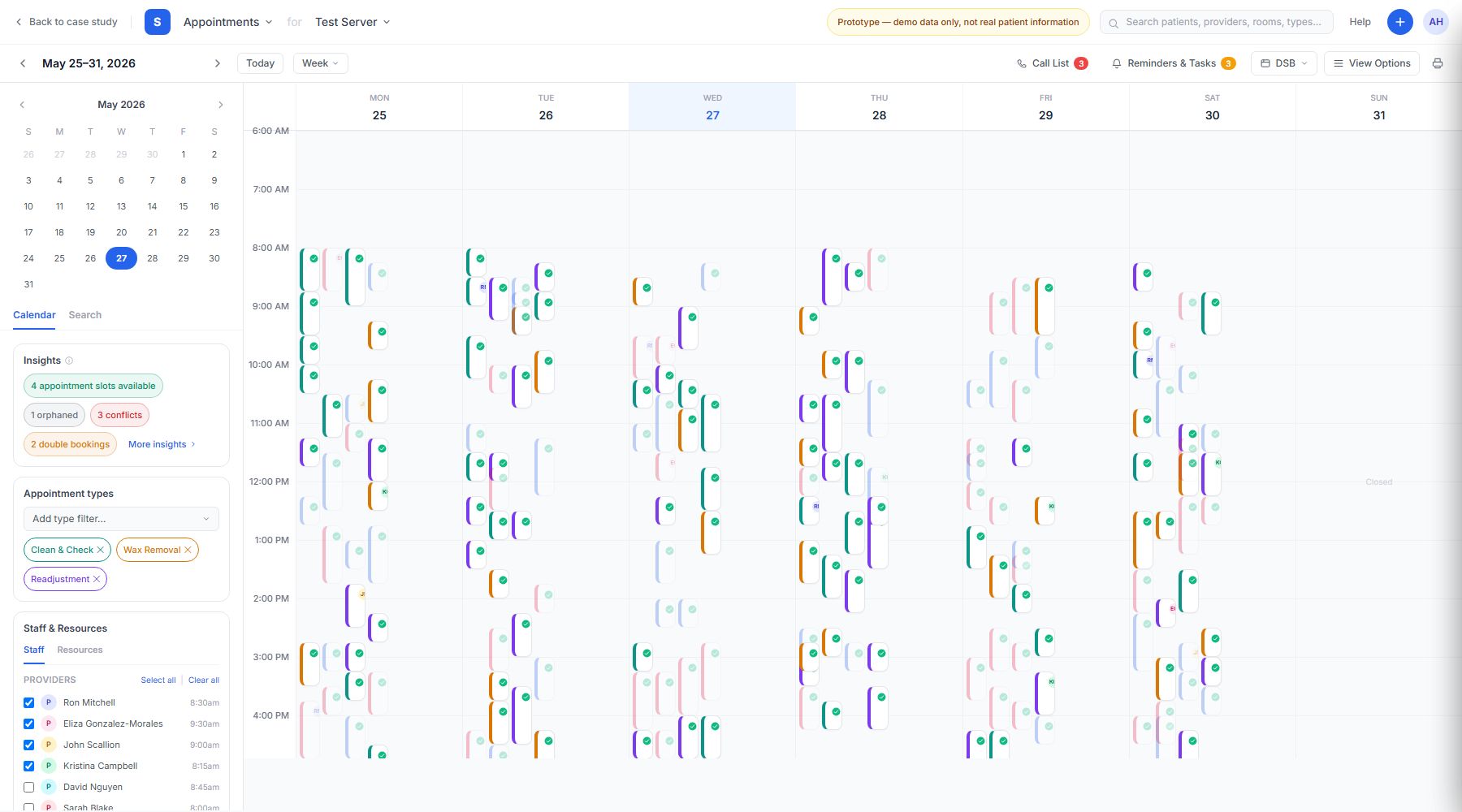
Selecting an appointment type filters and dims everything else on the calendar, replacing the original multicolor palette with a single, purposeful way to focus on what matters.
Four months into the project, three clinics churned to competitors, citing unanswered support tickets and no visible progress on the improvements they'd been promised. I worked with the Product Owner to shift from static specs to clickable Figma prototypes, so customers could see tangible evidence of the design direction before anything shipped. As the first MVP features went live, scheduling-related support tickets dropped, and over the following 4–6 months the sales team signed 2 new clients who cited the redesigned calendar as a factor. In follow-up interviews, existing customers said they hadn't expected the changes to actually ship. They specifically called out fewer modals, an easier-on-the-eyes color palette, and less scrolling. That shift from active churn to renewed trust and word-of-mouth referrals brought in 3 additional clinic sign-ups, turning what had been a losing trend into net growth.
Finding an open slot saw the sharpest gains. The new Insights panel surfaced conflicts and availability inline, cutting a manual scanning task down to single-digit seconds for both groups.
Times reflect observed ranges across moderated usability sessions; before-values from the legacy calendar, after-values from the redesigned prototype.
At the Product Owner's request, I extended scheduling and usability design patterns from the Referral Management platform to Costco's clinic enhancements. Costco represented Sycle's largest enterprise retail account, requiring dedicated schedule block logic that honored strict corporate compliance rules while maximizing clinical room utilization. I along with a Product Owner worked through countless requirements and design revisions to make sure these updates would allow staff to quickly create and clone DSBs without breaking standard clinic scheduling workflows.
Product Owner
1
Engineering
8 Engineers
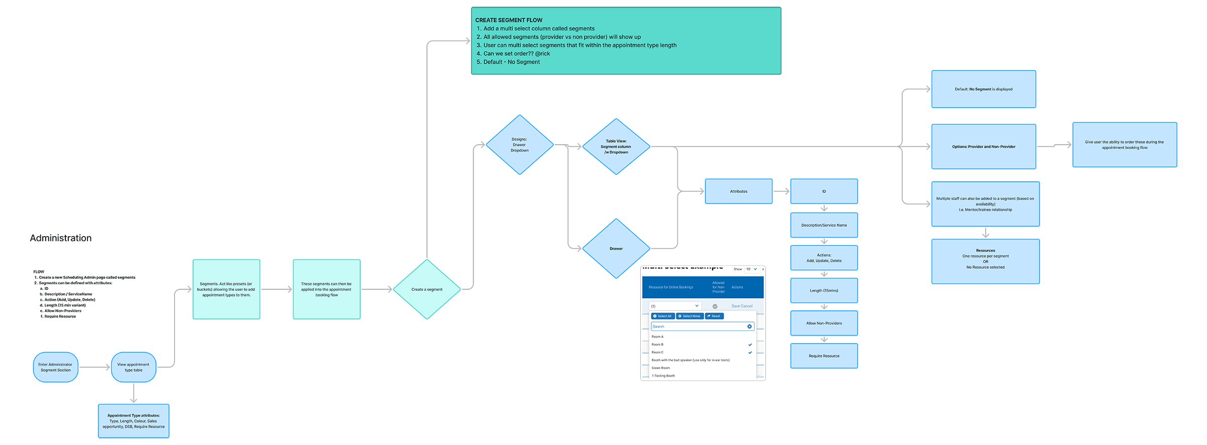
Reasoning Behind the Finish
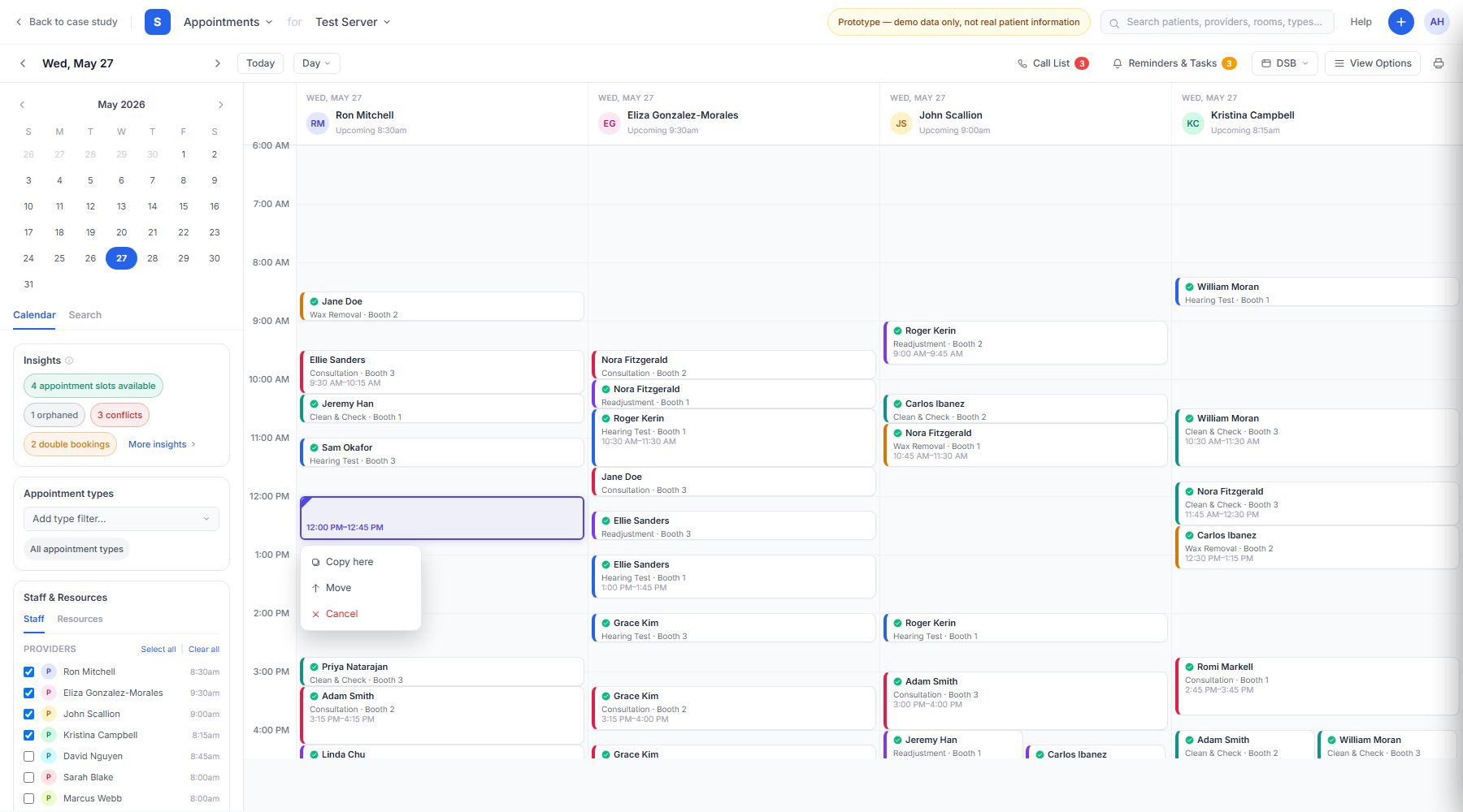
Staff needed to edit DSBs quickly, without invoking a modal. Drag-and-drop interactions (snap-to-grid with lit drop zones) allowed them to click and confirm changes on the fly, then duplicate, move, or delete the block in place.
Dragging a dedicated schedule block to a new time snaps it to the grid, then surfaces a quick Copy here / Move / Cancel menu right at the drop point, no modal required to confirm the change.
The Costco engagement was compliance-driven rather than metrics-driven, so its clearest evidence is qualitative and task-based rather than a business outcome like retention or contract expansion. Months before the on-site visits, I met separately over Teams with two groups, front-desk staff and clinicians, to baseline how long core DSB tasks took in the existing system. After weeks of iterative design and feedback rounds with the Costco U.S./Canada teams, the updated features were rolled out to a small set of pilot clinics. I returned to the same 3 on-site Costco Hearing Centres with a small team to observe staff and clinicians using the live features. The gains were immediate and consistent across both groups. Booking within a DSB slot dropped from minutes to under a minute, and pre-booking future DSB slots saw a similar drop. Clinicians' patient-notes capture time also improved substantially, aided by an AI transcription feature (built for another Sycle product and tiered into this rollout) that let them speak notes and append the transcription directly to the patient profile.
Baseline times captured via Teams sessions with staff prior to the site visit; post-launch times observed on-site at the same 3 Costco Hearing Centres after feature rollout to pilot clinics.
Patient-notes capture time improvement includes an AI transcription feature originally built for another Sycle product and integrated into this rollout, not a Costco-specific design decision.
Referral Management connected audiology clinics with external providers, replacing manual handoffs and fragmented follow-ups with a clear, trackable referral workflow that kept patients, front-desk staff, and referring physicians aligned.
I set the UX strategy for the Referral Management platform, mapping 30+ touchpoints across 5 user personas and running a strategic workshop that aligned Product leadership and shaped the resulting roadmap.
Due to the complexities of the referral workflow, Product leadership needed a faster way to visualize how far our feature-set needed to go before a roadmap could be mapped out. I structured my designs around leveraging Agentic-AI to quickly and iteratively design a working prototype that helped Product leadership understand and scale the level of work required and to successfully map out a roadmap.
Product Owner
1
Engineering
1 Engineering Lead
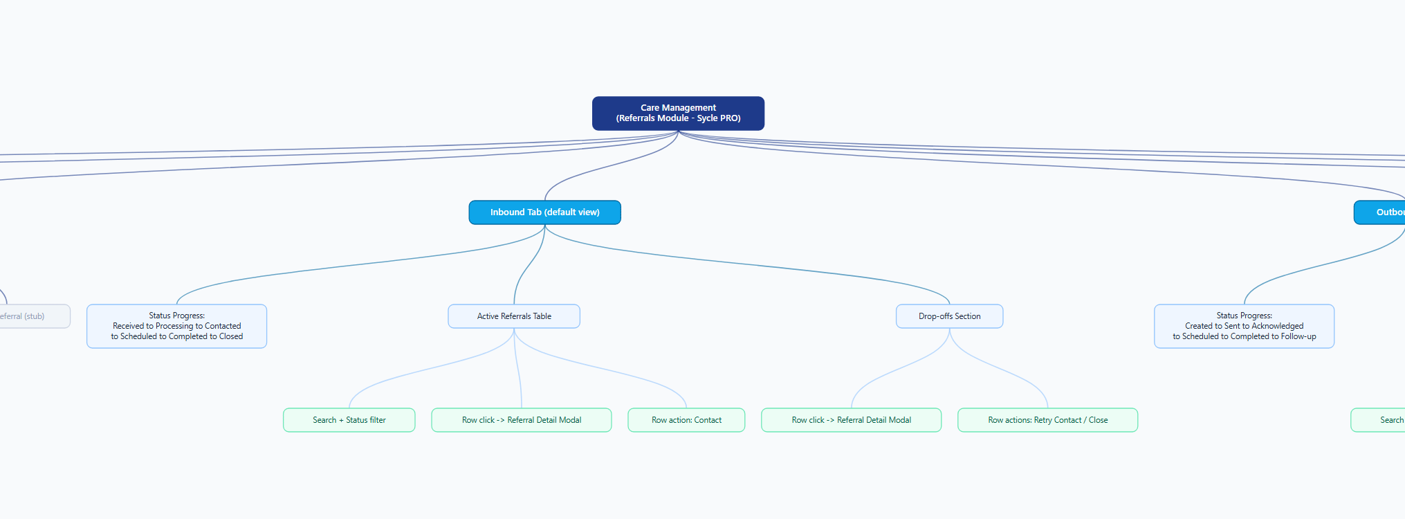
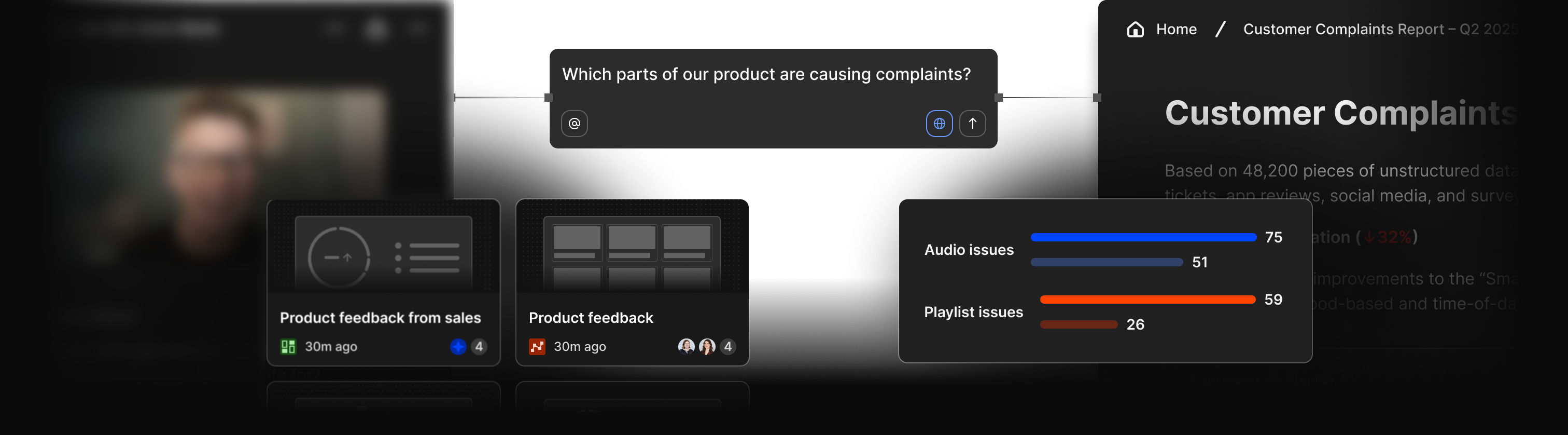
Product leadership needed to see the scale of the referral workflow before a roadmap could be scoped, a slide deck wasn't going to cut it. I directed an AI coding agent through a structured brief so the team could click through a working artifact in days instead of weeks. Every step was written or reviewed by me; the agent executed against it.
Open the interactive prototype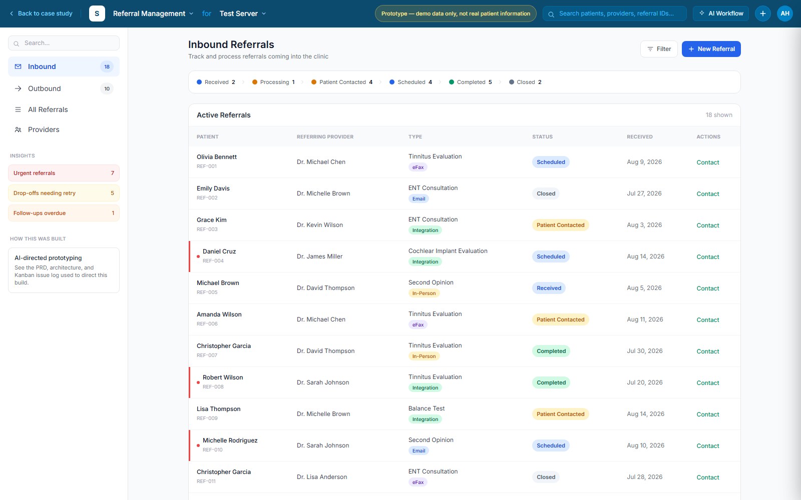
Defined the problem, users, and constraints in plain language.
Turned the brief into goals, personas, and functional requirements.
Broke the PRD into scoped issues with explicit human checkpoints on design-sensitive steps.
Cleaned up layout, accessibility, and edge cases into an executive-ready decision artifact.
The prototype includes an "AI Workflow" panel with the actual PRD and issue-log excerpts used to direct the build.
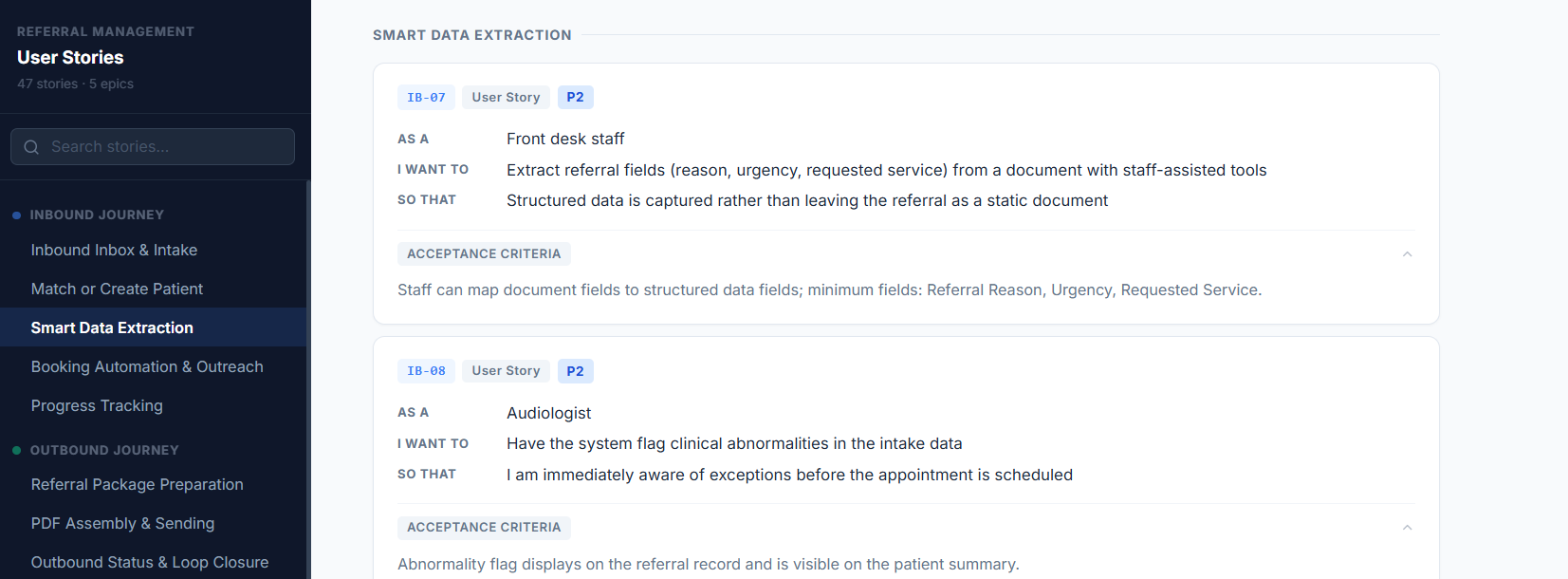
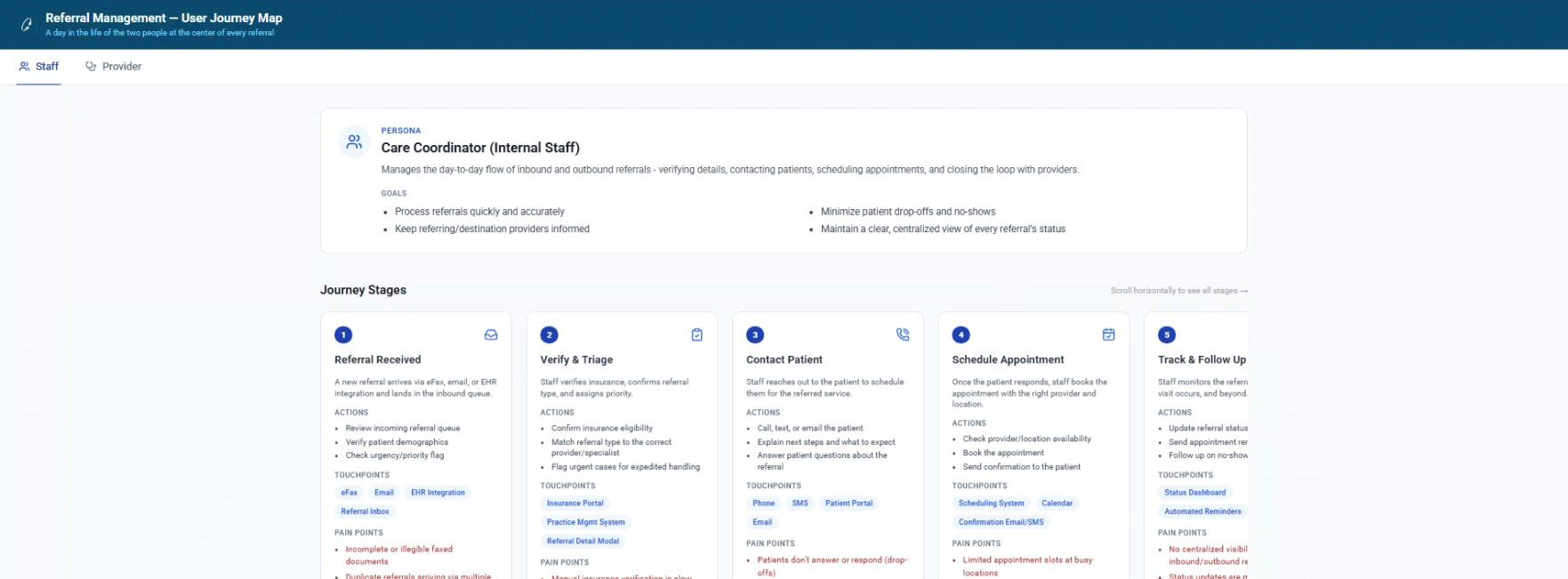
Sycle's referral system was aging, and understanding exactly where customers were losing trust in it was the first challenge. Countless customer interviews surfaced the operational realities behind multi-provider handoffs.
During the interview and feedback sessions, I uncovered fragmented referral workflows into a coherent system that protected business rules while giving front-desk staff and coordinators a clearer, more reliable way to send, track, and follow up on referrals.
The goal was to reduce referral leakage, improve follow-up compliance, and shorten time-to-close, while giving staff the visibility and control they needed to close the loop with fewer manual workarounds.
With the iterative use of AI, I directed the build of a clickable prototype, allowing me to discover and course-correct quickly. This helped me modularize complex features into iterative MVP releases that shipped quickly without disrupting existing clinic operations.
Delivering enterprise healthcare scheduling meant balancing rigid corporate constraints, scarce engineering resources, and a hard clinic go-live date. These trade-offs shaped what shipped first and how we preserved the core clinical experience across all three pillars.
Engineering saw a unified calendar for Costco and standard clinics as infeasible within the legacy stack. I designed a modular block-overlay architecture that isolated Costco's rules into configurable layers, letting the same calendar surface serve both without a backend rewrite.
We deprioritized AI-assisted features for launch and shipped calendar enhancements and Costco DSB support first, then queued referral management as a follow-up release tied to adoption metrics and integration readiness.
I directed an AI coding agent to spin up clickable referral prototypes in days instead of weeks, then cleaned up layout, accessibility, and edge cases to turn the output into executive-ready decision artifacts rather than production code.
Customer demographics ranged from 50-75 for Calendar users to 30-60 for Costco's enterprise accounts, so every color and opacity decision had to hold up across a wide range of vision needs, not just a design system spec. On Costco's schedule blocks, staff said "when the calendar gets busy, it gets harder to see DSBs." I slimmed the block sizing and added a corner dot to mark recurring DSBs, with an overwrite-conflict warning to prevent accidental double-booking.
Across the Scheduling calendar re-design, Costco DSBs and Referral Management projects, I standardized empty states, iconography, colour tones, loading states and error-messaging tone so the product felt like one coherent system rather than three separate builds. That consistency mattered because front-desk staff moved between all three workflows dozens of times a day. Familiar patterns meant less relearning and fewer mistakes under time pressure.
Broader ops and support-ticket trends pointed to an estimated 30% reduction in manual scheduling work across the full feature set. Directional, but consistent with the task-level gains measured in the Calendar and Costco pillars.